Responsive typography: finding the perfect font
When looking for the optimal font for your responsive web presence, you can take advantage of the wide range of free web fonts on offer. Check out the third and final part of our series to find out how to depict fonts in responsive web design and how to implement them using CSS.
Free fonts for responsive web design
Web fonts are the ideal medium for responsive typography, as they are based on freely scalable vector graphics. When a webpage that uses web fonts is loading, the fonts are downloaded from a server and subsequently converted for display in the user’s browser. This allows the font to adjust to the size and settings of the browser or device. A quick glance at the search engine results will reveal a great number of online platforms, all of which offer an diverse assortment of responsive web fonts available to download – some free, some fee-based. Some of the best-known font providers include Typekit and Fontspring, both of which boast a great selection of well-known fonts, including all the classics. You can also make use of the diverse range of free web fonts on offer, such as those offered by Google Fonts, Adobe Edge Web Fonts, Font Squirrel and DaFont. However, not all the fonts available on these resources are suitable for general use; for example, wacky and whimsical designs should be limited to titles and headlines. You should also be aware that the range of characters vary widely from font to font. This is of particular significance for those who need to use special characters such as symbols and accented letters. For this reason, it’s crucial to ensure your responsive web design includes a font that meets your requirements. Read on to discover some examples of the most versatile Google Fonts.
Responsive web fonts from Google Fonts
Established in 2010, the past few years have seen Google Fonts emerge as the go-to platform for many web designers on the hunt for the perfect responsive typography. Ever since its inception, Google Fonts has exclusively provided free fonts, which may be used for both commercial and non-commercial purposes. With Google Fonts, you have over 700 free web fonts to choose from, all of which can be downloaded and embedded into your web presence using a code.
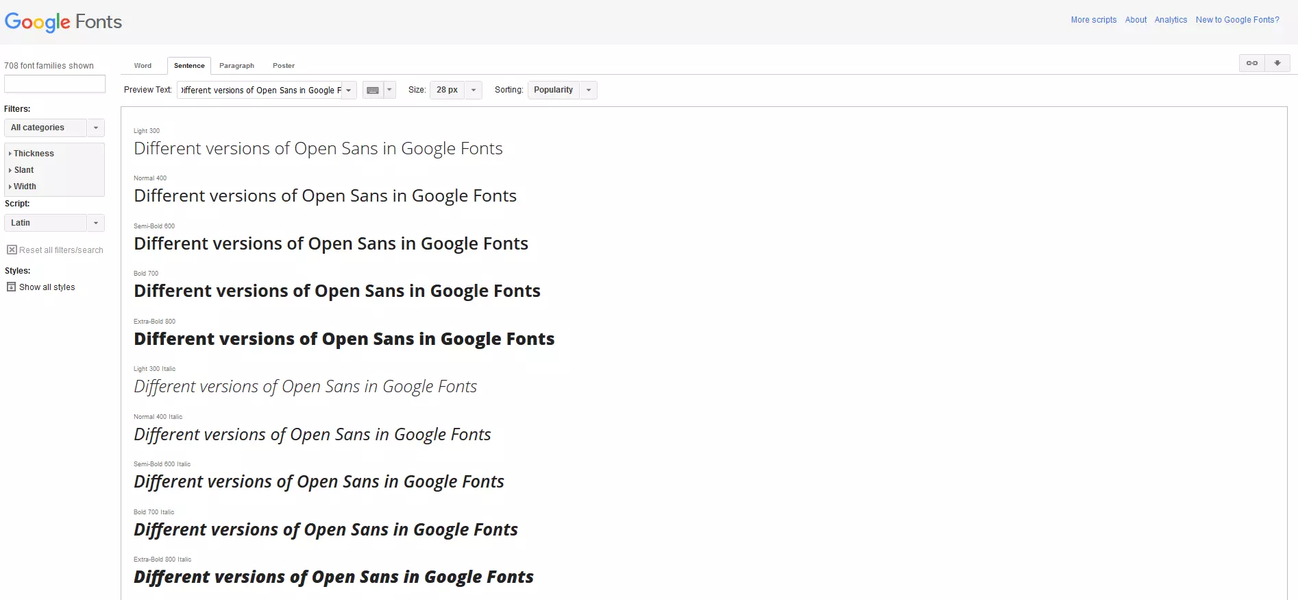
Open Sans
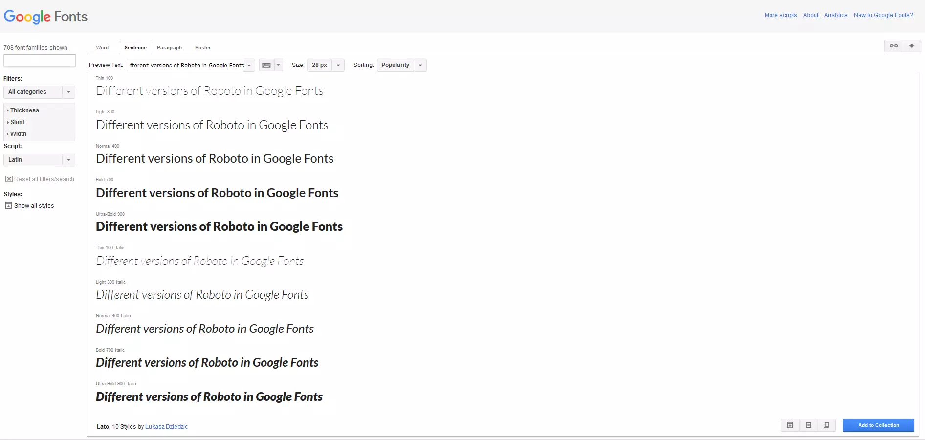
Roboto
‘Roboto’ was initially created as a font for Android operating systems and has been continually evolving since. This is another sans serif web font consisting of relatively thin letters, meaning that more characters can fit on a single line than with most other fonts.
Source Serif Pro
‘Source Serif Pro’ was originally designed for Adobe Systems software. The serif font can serve as an add-on to the sans serif font ‘Source Sans Pro’ and the monospace font ‘Source Code Pro’, which are available for free from Adobe.
Integrating typography with Google Fonts
These popular fonts can be found in the databases of multiple providers, including Google Fonts, Adobe Edge Web Fonts, and Font Squirrel. Here we see an example of how to implement the free font ‘Open Sans’ with Google Font.
- Search for ‘Open Sans’ in the search bar and click on the ‘Quick use’ button, which is indicated with the arrow symbol.
- You will then be presented with the variations of that font from which you can select your favorite(s). You can also specify here if you would like to use non-standard characters and symbols.
- A code will appear for both the <head> section of your webpages as well as for the CSS documents.
- To embed ‘Open Sans’ into an HTML document, paste the code (including the link to Google Fonts) into your webpage’s <head>. The command should look like this:
<!doctype html>
<html>
    <head>
        <meta charset="utf-8">
        <title>How to integrate a Google web font</title>
        <link rel="stylesheet" href="https://fonts.googleapis.com/css?family=Open+Sans">
    </head>
    <body>
    </body>
</html>
The second code defines the font in CSS:
body {
 font-family: 'Open Sans', sans-serif;
 font-size: 100%
}
As you can see, using Google Fonts to implement a free web font is a simple task. Along with these variations, you can also use Google Fonts to embed the font with the @import rule for CSS or Javascript.
Summary: a host of free fonts to choose from
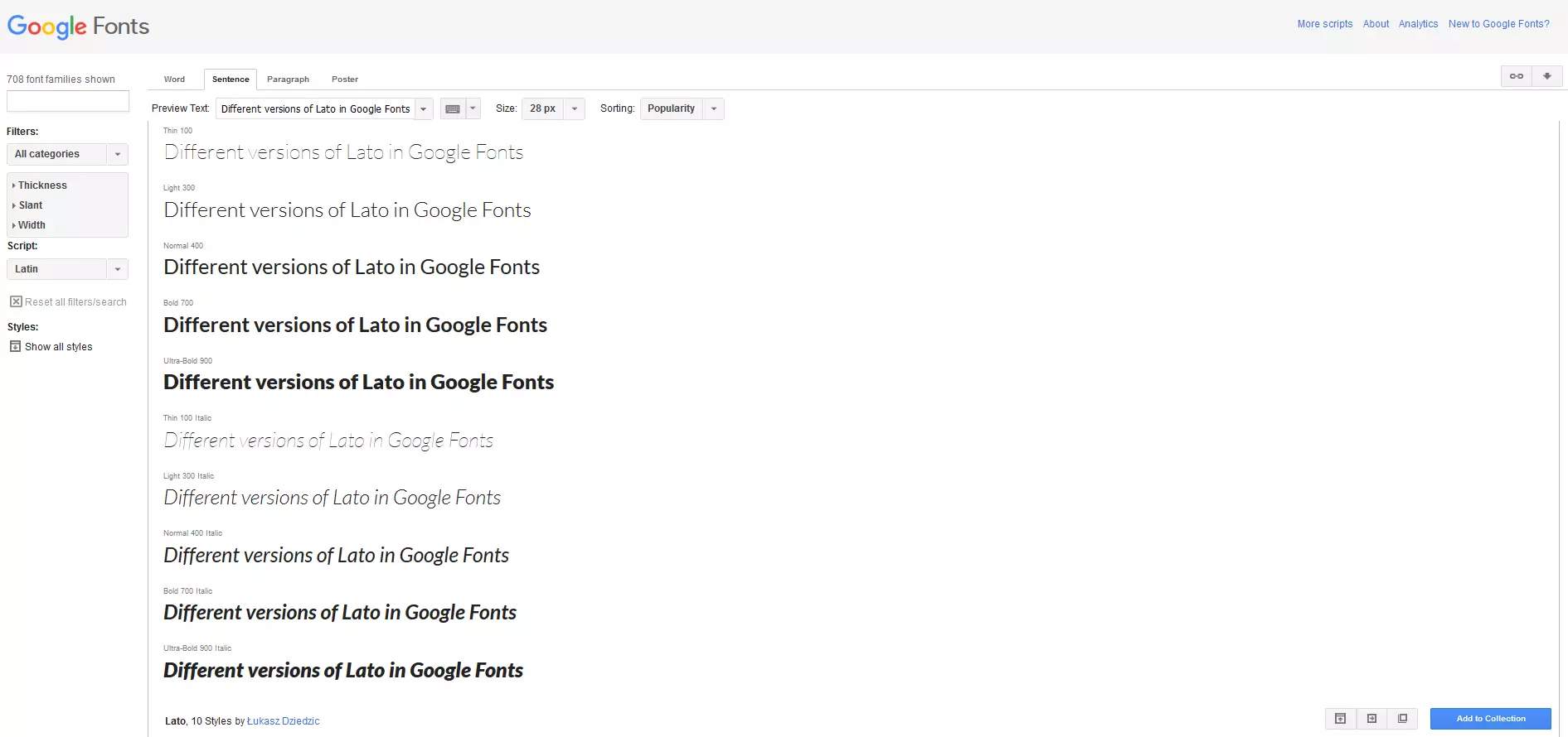
When it comes to selecting responsive typography for websites, there are a great number of resources at your disposal. Designers are spoilt for choice with web font platforms like Google Fonts, Adobe Edge Web Fonts, Font Squirrel, and many others offering thousands of free fonts that are easy to implement. It’s important to note that particular fonts, such as ‘Open Sans’, ‘Roboto’ and ‘Lato’, are frequently used across the web, as such, they are not very unique. You will have difficulty obtaining especially unique web fonts (in the sense of a corporate font) for free. However, the free web fonts available from such platforms do allow a great deal of freedom in terms of customisation. It’s also very easy to embed these fonts into a webpage, making your content available to different devices. For a summary of the first two parts of our series, as well as a guide on how to implement responsive typography, check out the third part of our series.


