Optimize Website Navigation
Anybody who deals with a website or a company’s online presence will sooner or later have to deal with the issue of web usability. This complicated-sounding term describes how user-friendly a website is in general. In effect, the objective of every website is to present visitors with the most useful platform for finding and using information, entertainment, products, etc. The site should be easy to use and offer something to the user; be it value, info, or something else. While in theory this might sound quite easy, in reality there are several necessary and important steps that are required in order to achieve measurable success. In terms of web usability, the decisive factor above all is website navigation that can then complement the web design and content in a meaningful way.
- Intuitive website builder with AI assistance
- Create captivating images and texts in seconds
- Domain, SSL and email included
Website navigation structures: The key to user-friendliness
There is a widespread misunderstanding out there when it comes to the topic of website structure; apparently, it should either be a sort of clickable “business card”, or else a tremendous work of art that should amaze all viewers with its optical extravagance. Anyone who thinks like this is a long way off the right approach and aims of good online marketing. First and foremost, websites are interactive communication channels that increase awareness of people, businesses, products, services, brands, artists, etc. This is done by attaining a large reach and then convincing users of the quality of content and/or products. This premise is valid for everything from private blogs to commercial online stores.
In order to make your website an online success, next to high-quality content and design, you also have to consider whether you have an optimal navigation structure. But exactly what is website navigation? What makes it good? What advantages does it bring? And how do you optimise it to bring more success (and turnover) to your website?
Navigation structure – the fundamentals of web usability
A navigation structure that is as clear as possible is the cornerstone of every successful website, as it is key to the visitor having a pleasurable experience. If a website’s structure allows someone to quickly and intuitively click through and find what it is that they are looking for, then it is much more likely that they will be open to becoming a regular customer or user of what the website is offering. In order for your website to be user-friendly enough that people will want to linger on it (i.e., a website that catches someone’s interest and interacts with them), it requires the following essentials:
Clear structure: users should be able to figure out the structure of the website and get their bearings
Intuitive interface: with very few clicks, users should be able to arrive at the goal of their search (e.g. information, products, services, etc.)
Understandable and useful content: as well as being comprehensible for users, it should also be relevant to them and/or provide solutions
Visible features for interaction: users should always be aware of how they can get in touch with the website operator and acquire his/her products/services (e.g., via questionnaires, registration, purchase, order, review, imprint, etc.)
A practical and simple website navigation is not only beneficial for visitors to the site but can also contribute positively to success in marketing; the easier and more successful a user experience on your website is, the more likely you are to lead users to click through and create conversions. This will be made evident by the user’s interactions with your site — for instance, they have been persuaded to order a product from your online store, subscribe to your newsletter, or even download a PDF with further details on what it is that you are offering. These “conversions” are measurable via analysis tools and help to increase the website’s reach, and hopefully its turnover to boot.
On top of this, optimal website navigation doesn’t just lead to happier users – it also makes your website more attractive from a search engine point of view, i.e., by giving you a better ranking in the SERPs (Search Engine Results Pages) and rewarding your site by displaying some of your subpages in the form of clickable sitelinks. This makes the improvement of website navigation also an important aspect of the SEO methods for enhancing your website.
Optimal navigation: Website examples and explanation
In order to ensure that your site has a good navigation structure, careful planning is of great importance. Only once the aims, content, and appeal of your website are clearly set out, you can then begin with intertwining relevant site navigation, web design, great content — and then integrate them all together into one cohesive website. Of course you might have the best content in the world, but it is of no use if it cannot be easily found. Therefore you need to firstly plan out a logical order and clear structure, and you should keep this in the back of your mind in everything that you do while building the website. Put yourself in the position of the user: how should the website navigation look so that someone could almost use it in their sleep? Next you will need a clear hierarchy for the topics with as few sections as possible so that the user can find what they are looking for in a matter of seconds — especially if it is their first time on your website. You should also always bear in mind that the attention span of the average internet user is usually quite short and there are generally a lot of websites out there that are competing with yours for this attention. This means that if a user does not find what they are looking for straight away, then it is a lot more convenient for them to return to the search engine and simply click on the next result. In turn this then leads to a bounce rate that will then have a negative effect on your website’s SEO prowess, and in turn on your overall business results. You can make life a bit easier for yourself by taking note of users’ general reading habits like the F pattern.The F pattern comes from proven studies into the common reading habits of internet users. It refers to the approximate scanning movements that readers make and what the eye takes in while looking over a text heavy website. It begins with a long horizontal movement over the top menu, then a downwards movement to read a bit more content across the page, before finally vertically scanning over the rest of the content on the page, i.e., in an F pattern or layout. This is further proof that you can only win customers over if you present them with the important content quickly, clearly, and in a compact manner.

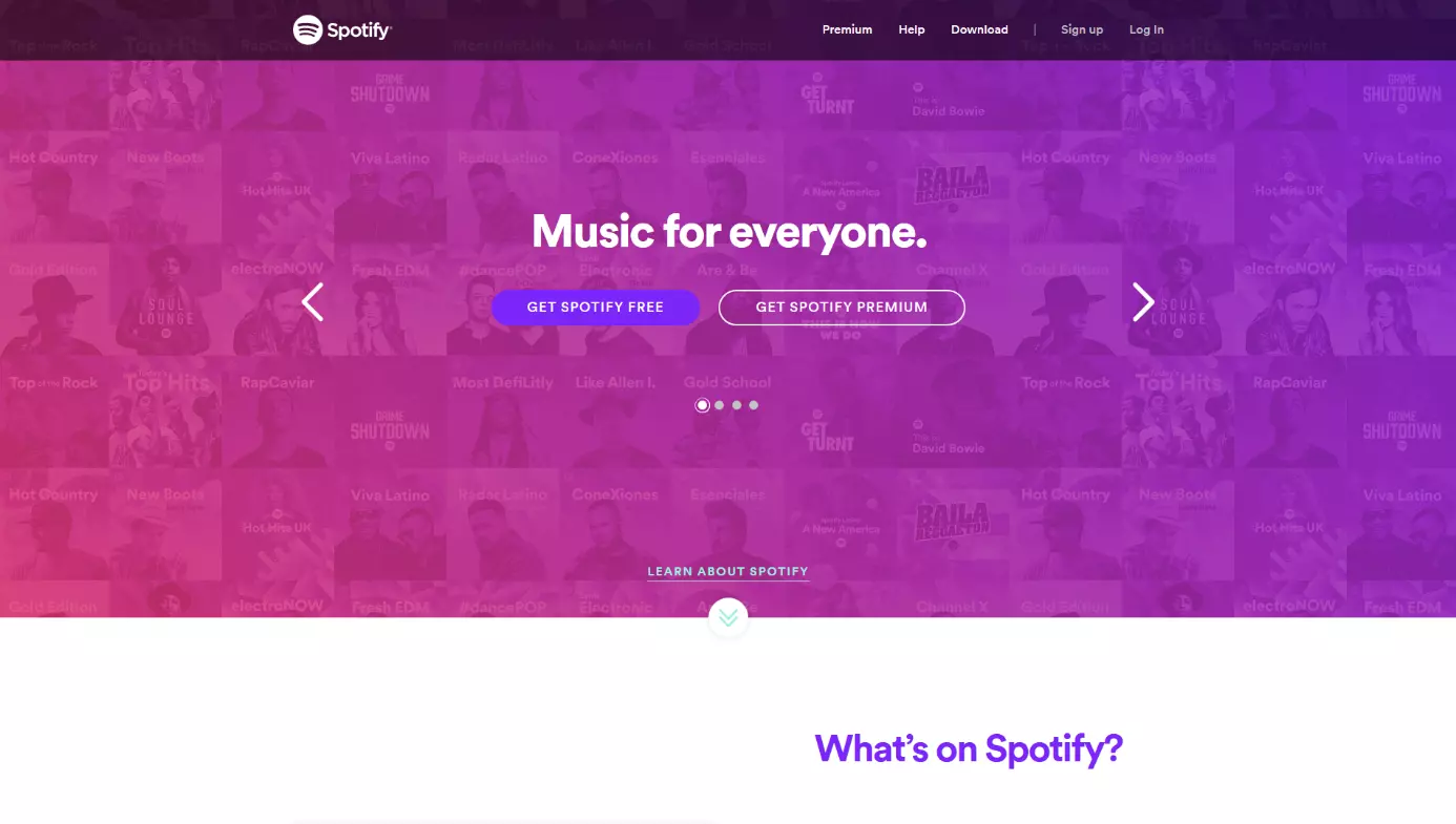
It is usually the case that, above all, good website navigation is made up of a logical hierarchical order, clear menus, as well as understandable labels and descriptions. For this reason it might be a good idea to limit yourself to a minimum number of sections. Approximately seven main menu sections per online presence are recommended. The menu should be visible; right at the top of the page is best so that it can be scanned from left to right. When naming the different menu categories you should also not be too general and instead opt for terms that users actually search for (e.g., with clothing menus use “Fashion” or “Male/Female” as opposed to just “Products”). What this then ensures is that customers can find the page they are looking for with the minimum number of clicks without having to navigate through hidden pages beforehand or ones that are void of any relevant content.
Depending on the extent and complexity of your content, it may also be advisable to organise your menu thematically with a main menu, submenus, and landing pages, i.e., with a maximum of three levels (in this order: General information – Specific information – More detailed information, with an interactive option as well). The main menu items refer to further submenus (be careful with using elaborate drop down menus as they may cover up important information and/or impair mobile users). The whole thing should then come to a head with the final subpage and an offer, along with a very clear call to action (CTA) that prompts interaction with the website. CTA buttons are the symbolic endpoint of the customer journey through everything that the site has to offer, and in the best case this journey will then end with the desired action, e.g., with a purchase, download, registration, or entering of contact details for future marketing campaigns.
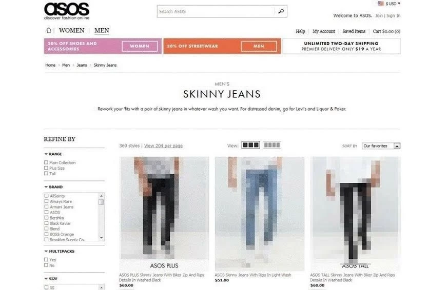
It is also possible to get an even better overview of the website’s structure through the use of a secondary navigation system, which is known as a “breadcrumb” navigation system. This allows you to present, through the use of keywords, a clear path from the main menu to a subpage. With this system, the user can then click on these keywords to easily and flexibly jump back and forwards between different pages. These breadcrumbs should also be found in the URLs of the respective subpages and can be compared to the shelves of a well-organised grocery store. Here, for example, you can find your favorite pasta if you go to the “Food” section, from there to the “Pasta” and finally to “Spaghetti”. By providing a search template on your website that operates based on specific terms being entered, as well as a tag cloud with internal links to important keywords, you can make it a lot easier for users to navigate your website.
Better website navigation through design and content
It should also be pointed out that a good navigation structure is not just dependent on layout. The style, color scheme, and content design of the website are also integral if you want to make your online presence more attractive for users and achieve a good search engine ranking.
Website navigation and design go hand in hand
Finding the right design for your website is strongly dependent on individual orientation. The best examples of this can be very clearly seen on many commercial websites. The design should be consistent throughout and make your site immediately recognizable, as well as being consistent with the corporate identity of your company. This should go hand in hand with aspects like the company logo, colors, branding, and layout. When push comes to shove, the design should speak to the visitor, bring about positive associations, and your offers should remain in their mind. The color scheme of your website should be nuanced, consistent and stylistically suitable when it comes to your business, industry, and product, i.e., neither too intrusive nor too monotonous. The accompanying layout should also be of a clear, consistent, and pleasant character, while still being able to communicate the information effectively and sustainably. When it comes to something like design, it’s becoming more and more important nowadays that mobile users are also taken into consideration. A responsive web design that is optimised for smartphones and tablets, helps not only web usability, but has also become a necessity for search engine optimisation.
Content for a good navigation structure: Image and text
Make sure not to overload your website with too many unnecessary and distracting images. A good navigation structure means the visual elements will contribute to the general orientation of the site. Place clearly visible navigation symbols and CTA buttons in several different places on your site so that users can access your offers at any time. Even here you should ask yourself: what is the central offer/message of my website and what actions (and where) should users be performing? Limit yourself to an expedient look that is appealing, but not aggressive. Carefully placed “white spaces” (the portion of the page left unmarked) can help to create a pleasant, clear, and precise overall message.
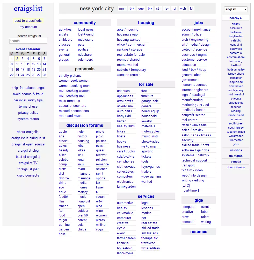
Internet users conduct searches based on themes, terms, and reactions — this is why good content should be the core of your website. Texts are the most important medium for information and order within your website navigation design. Text content should be formulated in a way that is clear, concrete, short, and to the point. Avoid using generalised statements, unsuitable language, and sentences that are complex and convoluted; all of the above will fail to offer any new insights or solutions to the user. Regardless of whether it’s an online article, blog entry, or a product description in an e-commerce store — users want to receive information that is informative and well-structured. This is why you need to pay attention to relevance and elements like title, headlines, sub-headlines, highlighting (e.g., texts in bold, i.e., phrases, lists, etc.) as well as paragraphs that are compact and coherent.

Thematically relevant visual content like graphics, photos, and videos can improve page orientation and the usability of your website. But these should also only be used sparingly and if they are, then they should contain effective and descriptive meta data. An effective combination of written language and image content, as well as thematically relevant internal and external links (to your own subpages) will improve the page orientation options as well as the quality of the landing pages, particularly in the area of SEO. However, these landing pages should then always contain what has been promised by the original subpage (anchor text). Otherwise the user, when they click on the link, won’t get what they were originally promised or looking for.
Summary: Your website lives on navigation, design, and content
A well thought out and optimised navigation structure is the backbone of good web usability for every website. As long as you follow a few basic rules, this should be attainable for every online presence. And with relatively little expense. At the beginning there is also the decisive question: what do you actually want to offer your customers and what is the best way to provide this? If you continuously work on structuring your online presence with clear navigation, a corresponding web design, and good content, then it will continue to become more user-friendly and come ever closer to delivering the perfect user experience.
