

Dark Patterns

You’ve almost certainly already fallen into the Dark Pattern trap yourself. Ever signed up for a service that you didn’t really want or bought something “accidentally”? These are both typical examples of the dark side of user experience design (UX design for short). Developers and site owners often deliberately make their apps and websites “user-unfriendly” to further their own interests. And major companies like Booking.com, Apple, and Amazon are no exception. They all use Dark Patterns to influence users.
Let’s take a closer look at how UX designers use Dark Patterns and what they hope to achieve.
What are Dark Patterns in UX design?
The term “Dark Patterns” was coined by London-based UX designer Harry Brignull in 2010. He defined it as follows:
“Dark Patterns are tricks used in websites and apps that make you do things that you didn’t mean to, like buying or signing up for something.” – Harry Brignull, Source: https://www.darkpatterns.org/
In other words, Dark Patterns are designed to trick people into acting against their own interests. They’re especially popular in the field of neuromarketing, where combined with knowledge of human behaviour and perception, they serve to influence consumers in order to achieve a particular goal. The first thing developers of Dark Patterns exploit is the fact that people have a limited capacity to take in new information. Most of us only skim-read long texts, meaning we easily overlook or misinterpret misleading wordings or deceptive representations.
The following video uses concrete examples to illustrate what Dark Patterns are and how they work:
 To display this video, third-party cookies are required. You can access and change your cookie settings here.
What are the different types of Dark Patterns and how are they used?
Companies and website owners use different types of Dark Patterns depending on what they want to achieve. In fact, they often use several Dark Patterns at the same time to reinforce the overall effect and hide their true intentions. The following describe some of the different types of Dark Patterns used by UX designers.
- Roach Motel: The idea behind this type of Dark Pattern is to lead users quickly into a particular situation and then make it really hard for them to get back out. Companies often use this trick to get people to sign up for premium subscriptions. The sign-up process is fast and simple, but the cancellation options are usually hidden in some part of the website where the user wouldn’t naturally think to look.
- Bait and Switch: This type of Dark Pattern is a kind of decoy tactic. The user thinks they’re doing one thing but ends up doing something completely different.
- Trick Questions: This kind of ambiguous question is often found on forms, the idea being to trick people into giving an answer they didn’t really mean to give. This type of Dark Pattern relies on the fact that most users will simply scan a text rather than going over it with a fine-tooth comb.
- Sneak into Basket: Here, sites sneakily add items to a customer’s basket by incorporating preselected checkboxes or confusing opt-out choices in the checkout process.
- Disguised Ads: Disguised ads are adverts that are designed to look like something else and thus trick the user into clicking on them. For example, they’re often made to look like part of the page content or the navigation pane.
- Privacy Zuckering: This term was introduced by the Electronic Frontier Foundation (EFF) and was named after Facebook CEO Mark Zuckerberg. Privacy Zuckering involves persuading users to disclose more than they really want to. For example, Facebook was known for making its privacy settings deliberately confusing so as to get as much data from users as possible. The General Data Protection Regulation has since made it harder for companies to obtain data through fraudulent practices. For example, you now have to actively consent to the processing of your personal data.
- Hidden Costs: Have you noticed that online shops often don’t tell you about taxes, delivery costs or other additional charges until you get to the very last page? These sites are relying on the fact that most users tend to complete their order anyway by the time they’ve got to this point.
- Price Comparison Prevention: To make it hard for consumers to compare prices, online retailers often hide the individual prices of products, such as by selling bundles of goods or services without indicating the corresponding unit price. Mobile phone providers were well known for using this type of Dark Pattern as far back as the early 2000s.
- Misdirection: The purpose of this Dark Pattern is to draw a user’s attention from one part of the content to another.
- Forced Continuity: Lots of companies ask people to provide their payment details to activate free trial subscriptions. After the trial has ended, the subscription automatically switches to a paid version without any reminder being sent to the customer. What’s more, the companies usually make the cancellation process very confusing and time consuming in the hope that the customer will just give up and let the subscription continue.
- Friend Spam: Here, an app or product will ask a user to give their email address or social media details on the pretext of checking for friends on their behalf. However, once the user has approved the request, their email address is used to send all of their contacts a spam message advertising the company with the aim of attracting new users.
- Confirm-shaming: This type of Dark Pattern aims to make the user feel bad about a particular decision. For example, on a message prompting you to sign up for a newsletter to get a 15% discount on your purchase, the “decline” button might be labeled “No thanks, I don’t want to save any money”.
Real examples of Dark Patterns used online
Many Dark Patterns fall into a rather grey area as far as the law is concerned, and some are actually illegal. Either way, they leave something of a bad taste behind once you know about them. We’ve rounded up a few real-world examples to illustrate the tricks to watch out for.
Booking.com
Booking.com attempts to play on customers’ emotions by displaying messages like “Only 1 room left!” and including fully booked options in the search results. This type of notification is displayed even if it’s just the rooms allocated to Booking.com that are all taken, rather than every room in the hotel. Other similar alerts like “2 other people looked for your dates in the last 10 minutes” also impress a sense of urgency on potential bookers, making them think they might be about to miss out. The European Commission has stepped in and ordered Booking.com to strip its site of all such manipulative techniques by June 2020 at the latest.
“As a market leader, it is vital that companies like Booking.com meet their responsibilities in this area ...” – Didier Reynders, European Commissioner for Justice and Consumers. Source: https://ec.europa.eu/commission/presscorner/detail/en/ip_19_6812
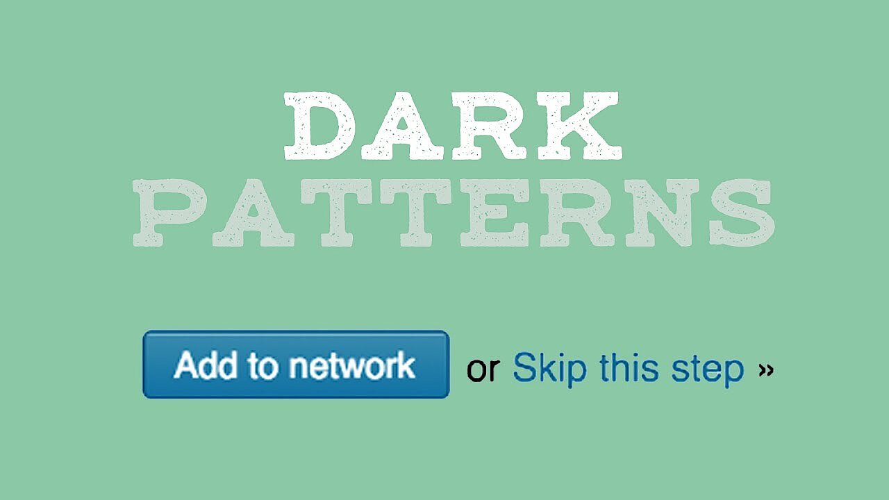
LinkedIn was behind what has become the best known example of Friend Spam. During the registration process, LinkedIn asked users to grant access to their email accounts, claiming that doing so would boost the new user’s career prospects by creating a “strong network”. In actuality, LinkedIn then used the new user’s email address to send invitation emails to all of their contacts. This behaviour resulted in LinkedIn being fined $13 million (around £10 million) in damages in 2015. Given the number of people on LinkedIn at the time, that worked out as around $10 (around £8) per member.
Ryanair
In late 2010, Ryanair tried to use Dark Patterns to sell more travel insurance. At one stage of the booking process, users were presented with a field labelled “Buy AXA travel insurance”. Instead of a simple “Yes” or “No” choice, users had to pick their answer from a drop-down list of countries. At first glance, it therefore looked like you had to buy the insurance, but on closer inspection, hidden among the endless list of countries there was a “No Travel Insurance Required” option.
Microsoft
When Microsoft launched Windows 10, they used the “Bait and Switch” type of Dark Pattern to encourage users to upgrade their operating system. In the Update Center, they presented Windows 10 as a “required update” which wasn’t true at all. This triggered anger and outcry among users and earned the scandal the name “Upgradegate”.
For some more interesting examples of Dark Patterns, check out Harry Brignull’s Hall of Shame on Twitter.