Banner design: how to design your own banners
Online advertising is a powerful tool in the online marketing arsenal. Display ads like banners are important factors if you want to advertise successfully on the internet. Advertising through graphic advertising media is usually known as display marketing. By integrating target-oriented advertisements into websites, you can catch the attention of potential customers without overexciting them with intrusive ad design. After all, poor advertising can also damage your brand, whilst well-designed advertisements lead to significantly more clicks and (generally) more sales. In spite of the ad blocker broblem, advertisements are still one of the more effective tools of online marketing.
There are many different types of online advertising, some of which work differently and have different effects:
- Pop-ups, pop-unders, and layered ads: These ads, which are particularly unpopular with many website visitors, are usually played out as soon as a website visitor carries out a certain action. Usually these ads use JavaScript and open new browser windows, which either pop up suddenly over the visited website (pop-ups) or are opened in the background, so that you can’t notice them until you close the other browser windows (pop-under). Some ads respond to mouse movement or scrolling: an ad is often displayed in the same browser that hides the underlying content of the visited website (layer ads). Users can now block pop-ups and pop-unders pretty successfully with ad-blockers, but not yet for layer ads. Since the aforementioned advertising often suppresses or obscures the actual website content, many users consider this type of advertisement to be disruptive spam. It is therefore unsurprising that providers like Google are now completely abandoning these advertising methods.
- Rich media: Small audio and video elements should reach the user quickly, but still fit seamlessly into the website. These advertisements can be placed statically or “jostle” into the content – e.g. through interstitials that are inserted before the advertisement is set up. A key element of rich media is that it offers extended functions that motivate users to interact with it, compared to traditional forms. Small games and other interactive elements are often integrated into these displays. However, the comparatively large data volumes of rich media content mean that they cannot always be displayed on websites seamlessly. The increased data volume can also interfere with browsing on the user side. This applies, in particular, to mobile use, where a lower bandwidth is usually available.
- Text displays: The most minimalistic form of advertisement – text advertisements usually consist of a short advertisement title, which simultaneously links to the advertiser’s web page, a UDL that leads to the advertiser’s homepage, and a short description text. They are mainly used in search engine marketing.
- Video advertising: Whilst online marketers initially focused on text and banner advertisements for technical reasons (because they could be played out without problems even with a weaker internet connection), advertising videos became increasingly interesting with the growing use of broadband connections. Advertising videos are sometimes played automatically on a website. They can be integrated as usual in a certain area of a website, or be switched as interrupting interstitial before the construction of a just-accessed page. Layer ads that are placed over the website text also often contain video ads. Videos are usually integrated using Flash. Used incorrectly, however, advertising videos can have a very annoying effect, since they usually take up a lot of space on the web page (or cover it almost completely), and often the sound is activated by default. On the other hand, videos can be used to present advertising content in a more appealing or impressive way than any other advertising format.
- Banner advertising: As part of banner advertising, marketers use predefined advertising space on websites to advertise (usually static) graphics for specific brands or products. These banners are resource-saving and usually do not replace the actual website content. However, advertising banners are faded out by most ad blockers, although they appear to be much less intrusive than pop-ups or layer ads. Banner effectiveness depends heavily on the advertised product and format. If you advertise a product that needs to be displayed visually (e.g. food or clothing), you only have space for a corresponding picture on the larger banners. For advertisers, tracking and targeting makes it easy to understand how many users become aware of their offer through a banner. Another advantage: banners are relatively easy to create. Therefore, advertising banners are also suitable for the marketing of smaller companies.
Advertising banners are ideally placed using an ad network like the Google Display Network, and are a popular compromise solution: they are not as eye-catching as layer ads, and do not allow for a product presentation as impressive as elaborate advertising video ads, but they are also perceived as less annoying by comparison. In contrast to pure text displays, they also work with visual stimuli. Well-designed advertising banners entice the user to call up the corresponding offer page with just one click. However, the advertisement design is also extremely important: in most cases, your banner advertisement just has a few seconds to reach the potential customer. To have your advertisement be perceived positively, you need to pay attention to certain design principles. This article explains step by step how to create compelling banners.
A certain amount of basic experience with image processing programs is required here. If you are still looking for a suitable program, you can also find more detailed information on free image editing tools in our guide.
Advertising banners: common formats
Throughout the history of the internet, certain specific advertisement sizes have become the status quo. Google explains in this guide what the embedding or environment for each ad format is.
There are distinctions between the following formats, among others:
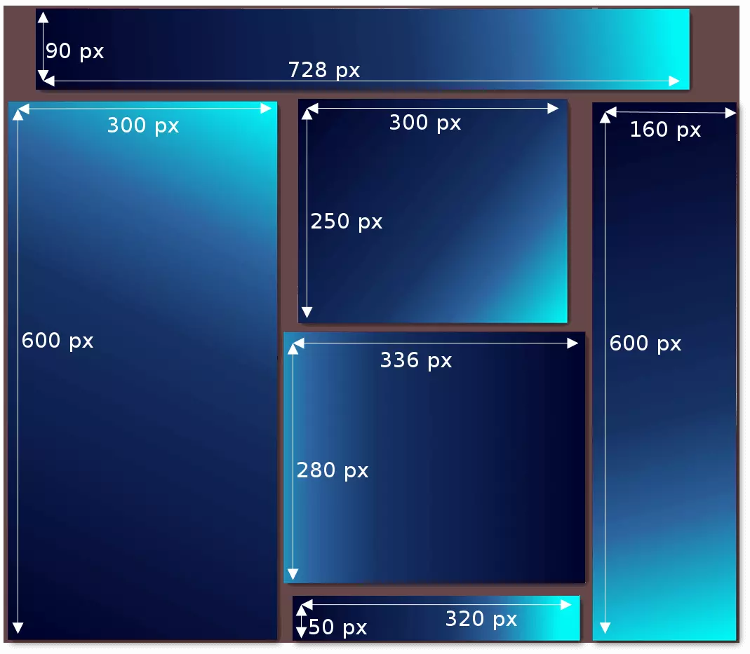
| Name | Dimensions in pixels | Offers space for | Embedding |
|---|---|---|---|
| Leaderboard | 728x90 | Text and a (small) image | Main content and forum websites |
| Half page | 300x600 | Text and image(s), interactive buttons, advertising messages, test results and awards | Large display outside the website, right or left margin closing |
| Medium rectangle | 300x250 | Image and text, possible inventory performance | In continuous text, in navigation, at the end of the article |
| Large rectangle | 336x280 | Image and text | In continuous text, at the end of the article |
| Mobile leaderboard | 320x50 | Text and (small) | Optimised for mobile websites (lower area) |
| Wide skyscraper | 160x600 | Image(s) and text, large advertisement inventory, interactive buttons, advertising message, test results and awards | Right or left margin closing |
Keep in mind that the graphics for your banner should be no larger than 150kb. Suitable image formats are .PNG and .JPG, as well as others for animated ads. Additionally, you should consider three core contents of your banner advertisement:
- Logo: Your own logo is essential when trying to increase brand awareness. Good logos can be recognised in a fraction of a second, and can be designed so that they won’t be perceived as annoying. A badly made logo, on the other hand, can cause considerable damage to the brand, since an unprofessional logo will conjure the image of an unprofessional product to the consumer. Therefore, it is worth investing sufficient time and resources into your logo design. Our logo guide will give you helpful tips on how to create an appealing one.
- User promise: Your ad needs to communicate exactly what is on offer in just a split second. The viewer should be able to recognise the offer, so that their attention is “rewarded” with information. If the information is relevant to the viewer, interest is generated. If you’re advertising low prices or a special offer, you can just display the price (“Flights starting at £10!”) or a percentage discount (“Now 20% off shoes!”).
- Call to action: Your advertisement needs to be clearly interactive. What will happen if a user clicks the ad? Simple text and buttons (“Go to shop”, “Redeem voucher”, “Register here” etc.) make sure the user knows what clicking on the ad will do, so that they will know for sure that clicking on the ad will be of value to them.
Creating your own advertisement banner: a step-by-step guide
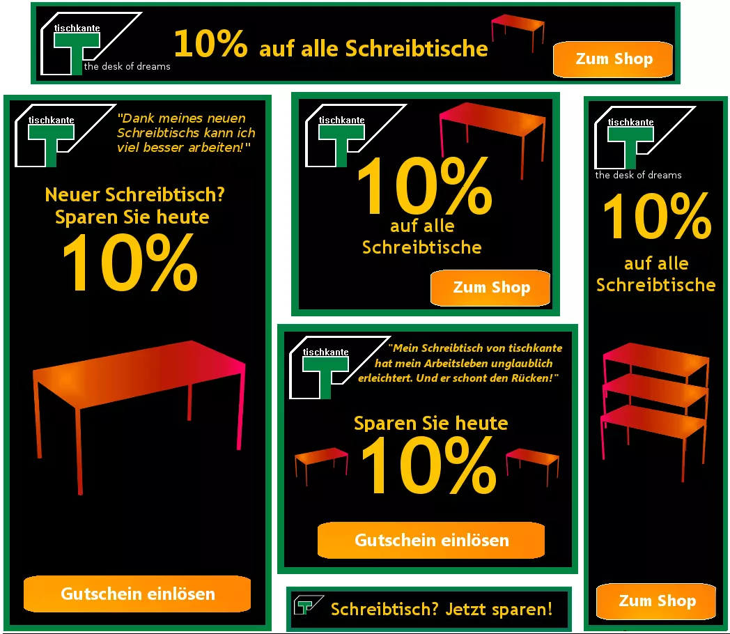
We will use a fictitious online desk store as an example for this guide. The name of the company is Table Edge and their goal is to entice customers to visit the online store using advertisements. That is why we have decided to create 6 graphics in total, all of which should have a uniform design and contain the company logo. A dark background colour for the banner is agreed upon, since the advertisement will appear on darker forum websites. To make the offer more attractive, a 10% discount for customers accessing the store through one of these ads will be promised. The three most important success factors in banner advertising have been taken into account already:
- An offer logo has been integrated into the advertisement that should be well received by customers and can create brand presence.
- The discount gives us a promise we can advertise, making our ads more attractive.
- Our request for action consists of a button that links to our shop. In this way, we can keep our promise to the visitor, and it also makes the function of our ads obvious to viewers.
Setting the frame and logo
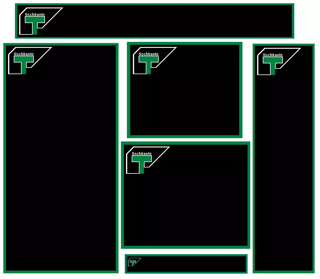
You can use a frame to mark your ads apart from the usual website content. This should be designed according to your logo – this makes the entire display more homogenous and coherent. Since advertisements need to be readable in fractions of a second, the frame does not need to be too extravagant. In our example, the advertising banner matches our logo and frames are usually only a few pixels wide.
You also need to strike the right balance when designing and positioning the logo. Ideally, it should be easily recognisable without attracting the viewers’ attention. To do this, place the logo at the edge or in a corner. This means that the brand is recognisable and you still have enough space to present your special offer or product images. If you don’t have high brand recognition, it can sometimes be useful to integrate the brand name into your logo. For our fictitious desk shop, we can assume that the logo alone will not be enough for users to recognise who is running the advertisement. Therefore, we have incorporated the brand name into the logo. When it comes to mobile leaderboard, however, there is no choice but to use a logo without a grand name since there is such limited space available.
A new study underlines the importance of a memorable logo. Therefore, invest sufficient time in choosing and designing your logo!
| Things you should do | Things you should avoid |
|---|---|
| ✓ Place the logo on the edge | ✗ Place the logo in the middle |
| ✓ Decent frame design | ✗ Design a very conspicuous border |
| ✓ Stylistically consistent design of frame and logo | ✗ Choose a logo that is too large |
| ✓ If necessary, include your brand name in the logo | ✗ Leave an unrecognisable logo with no brand name |
The text: special offers and user promises
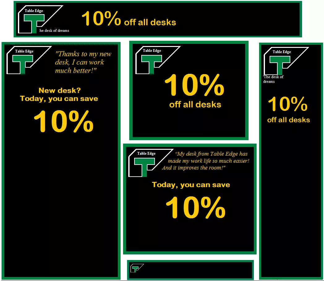
The special offer is the core of your ad. This should immediately catch the viewer’s eye and highlight the added value of your offer, product, or service.
In our example, we want to advertise a 10% discount. Percentages usually have a positive effect on the viewer, since they are easy to understand and point out any added value of the special offer. In the context of advertising, the viewer usually immediately understands the meaning of those percentages without having to read the accompanying numbers. You can highlight the corresponding numbers too, depending on the ad format.
In our example, we are able to communicate the special offer through the advertising banners in wide skyscraper, large/medium rectangle and half-page formats by highlighting out 10% discount. Additionally, we chose a font colour that sharply contrasts with the frame, background, and logo. Smaller texts that refer to test results and customer quotes complete the advertisement. The accompanying text needs to be more concise than the actual special offer – the mobile banner ideally illustrates the special offer in just 3 to 5 words.
The choice of font is also important. It should be clearly legible so that the advertising message can be grasped quickly at a glance.
| Things you should do | Things you should avoid |
|---|---|
| ✓ Write succinctly, reduce down to the essentials | ✗ Create an elaborate text |
| ✓ Create colour contrast to the rest of the display | ✗ Use poorly legible text due to lack of contrast |
| ✓ Easily readable, large font size | ✗ Use fonts small, confusing fonts |
| ✓ Highlight a number or keyword | ✗ Uniform design of complete text |
| ✓ Integrate a catchy slogan | ✗ Choose an intrusive/untrustworthy slogan |
Buttons and prompts
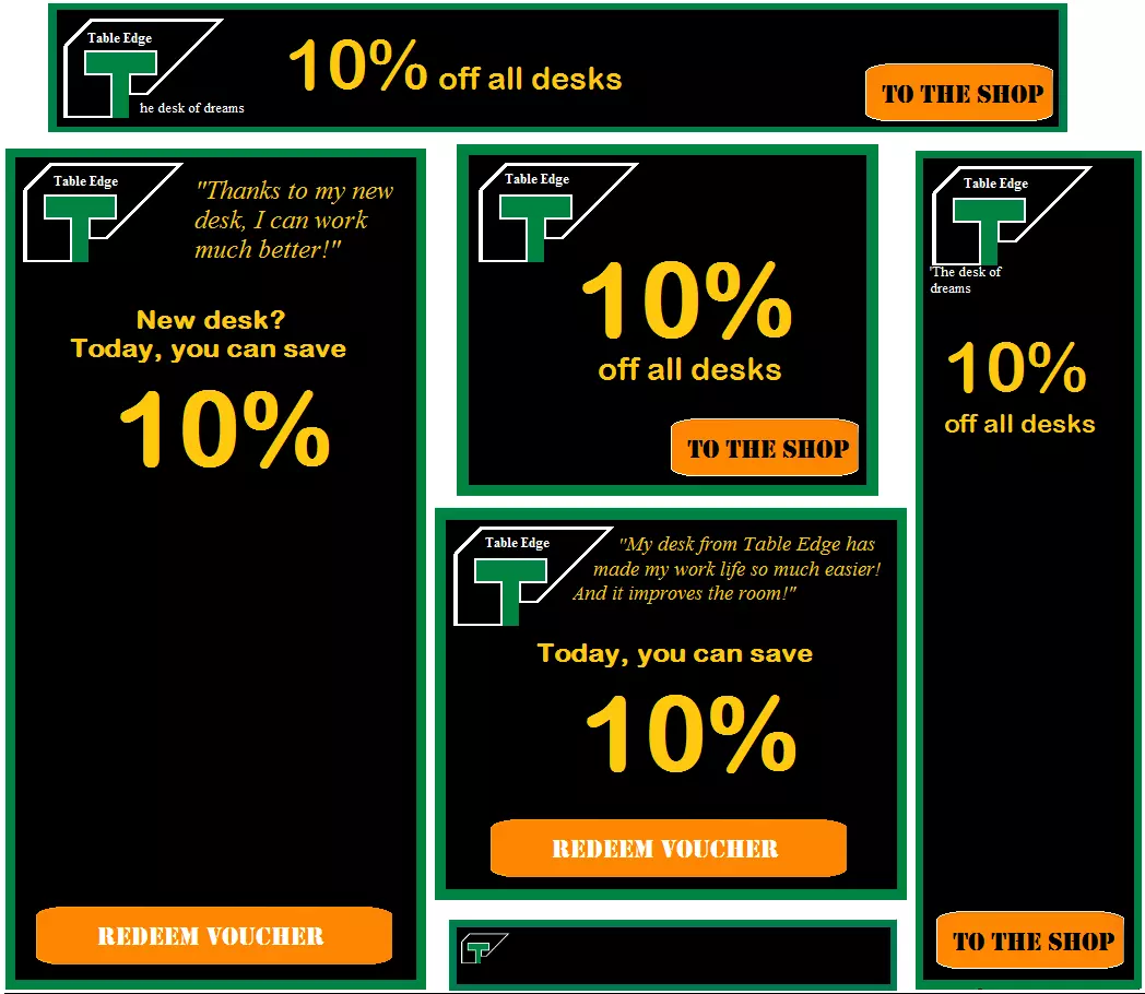
Advertisements should generate clicks. However, for transparency reasons, the ad should be designed so that visitors known what to expect when they click on your ad. Plan your explanation section like a prompt, which increases the effectiveness of the display enormously. The most popular prompt for action is the button, whose caption indicates to the viewer what clicking on it will do.
Since advertisements often lead to action by the visitor, the button is probably the most important component of the banner and must stand out clearly from the rest of the display. Elements that contrast with the background of the ad in terms of colour are usually very noticeable. In our example, the button in the advertising banner is bright orange and is next to the special offer information, making it the most attention-grabbing element of the advertisement. Due to its small size, the mobile leaderboard can be regarded as a kind of button – so you should not use a special button there.
The prompt should be positioned so that it forms “the end of the reading path”. In this way, the display first conveys the most important information (the user promise) and then advertises the click button (prompt). You should always keep the viewer’s natural reading direction in mind.
| Things you should do | Things you should avoid |
|---|---|
| ✓ Highlight buttons in colour | ✗ Making buttons too discreet |
| ✓ Position buttons according to the users promise at the end of the reading path | ✗ Arbitrary positioning; positioning in front of the user promise |
| ✓ Keeping the prompt text short | ✗ Formulating a prompt too elaborately |
Additional visual elements
To make your advertisement banner stand out even more and give the viewer an impression of your special offer in very short time, without even having to read the text, you should integrate more graphic elements into your advertisements. These may be images that refer to your product range, for example. In our case, we opt for a desktop symbol that clearly shows the viewer what Table Edge is all about.
You can get a little more creative when it comes to using picture elements. Don’t overdo it though. An ad overloaded with graphic gimmicks deters viewers rather than arouses interest.
Depending on the industry or brand, it can be useful to install a key visual. This is a key element that represents your brand. If you run an online shoe shop, you ideally have a shoe pictured somewhere in your ad. Fast food chains usually show an ideal image of their product (like a hamburger) in the advertisement. In our example, we want to show the customer immediately that it’s all about desks.
If you offer a wider range of different products, you can also show a selection of your most attractive products in some advertisements. These can be movie posters if you run a streaming service, for example. If you offer a photo service, a particularly attractive photo would suit that ad very well. Large formats like half pages and wide skyscrapers offer you a lot of space to use creatively for this purpose. Always make sure that you have rights to the images you use, however.
| Things you should do | Things you should avoid |
|---|---|
| ✓ Using supporting visual elements | ✗ Display overloaded with too many elements |
| ✓ Select elements that can clearly be assigned to your brand | ✗ Insert insignificant elements for your brand |
| ✓ Show a selection of products | ✗ Overtax the viewer with too many product suggestions |
| ✗ Use images without clarifying the rights of use |
Examples of visual elements on advertising banners
You can divide your ad into sections that are distinguished by contrasting colours. This makes your ad look like an independent web window and catches the eye. In the medium/large area, the special offer and call to action continue to be prominent. Brand logo and slogan take up space in the lower area.
A suitable image conveys important information faster than a simple text. In the above example, a fictitious image processing program is advertised – therefore it makes sense to show a possible result of this image processing in the display. The viewer should be able to make a link between the image used and the product.
If your product is successful in testing, or has won a prize, you should include this in your advertisement. Graphic elements like stars are familiar to the viewer and evoke positive associations. Some test pages also offer custom graphics that are easy to integrate. Consumers should quickly be able to identify graphics associated with well-known consumer organisations, and associate them with high-quality, serious products.
Advertising using personal pictures is also common: online shops often advertise with models who appear in their advertisements. Sports equipment suppliers rely on prominent sports stars to arouse positive associations. Food manufacturers primarily use images to market their products for consumer needs. In the above example, the viewer should establish a connection between the primeval forest landscape and perfume. Additionally, the product can be quickly recognised thanks to users having seen the image in stores.
The intelligent use of images in advertising banners is therefore essential for marketing success.
If you use other people’s images, please make sure that you have secured the legal usage rights to these pictures. Otherwise, you run the risk of legal consequences.
Using animation in advertisements
Many banners contain small animations that are designed to attract attention. These dynamic .gif images can look very professional when done correctly. However, they also require more work and expertise than ordinary banner advertisements. If you create an image file for each animation step, you can use this free online tool to turn your images into a .gif file.
The same applies to animated advertisements: if you bombard the viewer, they will ignore them at best or be annoyed by them at worst. After all, too many image changes can considerably disrupt your internet streaming flow. For this reason, users use ad-blockers that block almost all advertising formats. Some animations also cause the display to look a little dubious: for example, if you make your button or prompt glow brightly, possible gambling associations may be evoked and could remind a viewer of spam pop-ups. Consumers will quickly consider them to be frauds and clickbait – this could damage your brand’s reputation.
Ultimately, an animated advertising banner can lead to success – but the design should be left to professionals who can find the right balance and make animations look fluid. Poorly animated advertising banners have a disturbing effect.
The most advanced kind of advertising banners are the interactive ones. However, it takes expert knowledge to create one. Here you will find a selection of interesting, playful banner advertisements.
Examples of bad advertising banners
If you consider the three factors that contribute to successful banner design (brand logo, special offer, prompt) and follow the design and layout tips in this guide, you can start designing your own advertisements. To avoid typical beginner mistakes, here are a few more examples of things you should avoid when designing banner advertisements.
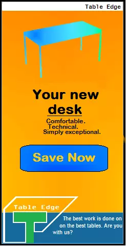
Example 1: lack of branding
This advertising banner is not going to inspire many clicks. The brand logo is missing, which means that there is no way for a viewer to associate the ad with the correct company, which can make viewers suspicious. The brand logo should clearly be on the banner.
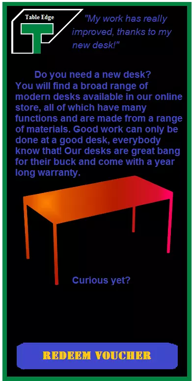
Example 2: lots can go wrong with user promises and special offers
The banner shown above is problematic for several reasons: on the one hand, the lack of colour contrast makes it difficult to read. If the reader has to exert their eyes to comprehend a text, then the ad is poorly designed. In this case, the blue on black is relatively difficult to decipher. Additionally, the text is too long. It is questionable whether the viewer will even read the advertisement, as the point of an advertising banner ad is to understand the content within a few short minutes, otherwise readers will just skim over it and move on. Keep the main body of text short and concise to ensure good readability.
You should of course make sure that your text does not contain any spelling or grammar errors. If the advertisement is low quality, it makes sense for the consumer to assume that the product is also low quality.
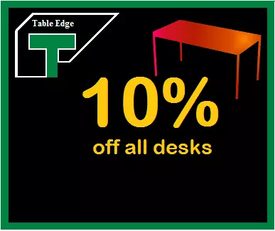
Example 3: no action without a prompt!
Judging by the above banner, it is not clear whether clicking the banner will lead you to the online store or bring the viewer to a voucher. Since there is no prompt (like a button), the function of the banner is unclear. This makes the viewer suspicious and makes it unlikely that they’ll click on the advertisement. Always make it clear with your advertisement what clicking on the ad will do.
Advertising design: general tips for banner design
- Brand uniformity: Try to design your advertisements according to your website design. This increases the brand recognition, and many users should be able to recognise what the company is advertising by the design alone.
- Adapt the layout to the pages where your ads are likely to appear. Ideally, your ads should look like they are an integral part of the website rather than a disruptive element.
- Focus on the basic design guidelines: Advertisements have to attract attention and marketers often achieve this in unusual ways. However, even if you stick to certain rules when it comes to colour design or font choice, you can create a good advertisement. To do this, familiarise yourself with the concept of complementary colours.
- Take note of colour symbolism: Colors can cause different viewer reactions and activate different associations. If you sell an organic product, a green-brown color scheme will suggest environmental friendliness. Beauty products often use pale pink and blue in their advertising schemes. Be sure to consider your target group when choosing colours.
- Invest enough time and resources: A poorly made advertisement can do more harm than good to your brand. If you are not sure enough about how to use graphics programs, you should leave designing your advertisement to a professional.


