Quick and Easy Mobile Optimised Websites
 Internet & e-mail address included
- All the webspace you need
- Always up-to-date
- 24/7 customer support

Create a mobile optimised website
Why is it important to create a mobile website?

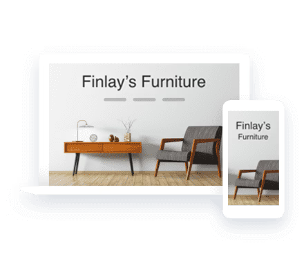
Optimised for all devices
Design templates
Device View
Contact information at your fingertips
Choose your MyWebsite package
From idea to website in record time with our AI Website Builder
Intuitive website editing with simple design options
Free domain for 1 year 0
Professional email address with 2 GB storage 0
10 GB webspace & 10 pages
Competitor tracking with marketingRadar 0
From idea to website in record time with our AI Website Builder
Intuitive website editing with advanced design options 0
Free domain for 1 year 0
Professional email address with 12 GB storage 0
50 GB webspace & 200 pages
Competitor tracking with marketingRadar 0
SiteAnalytics 0
Online booking tool 0
AI Text Generator & AI Text Improver 0
Professional design with the AI Image Generator 0
AI SEO Text Generator 0
From idea to website in record time with our AI Website Builder
Intuitive website editing with advanced design options 0
Free domain for 1 year 0
Professional email address with active syncing on all devices and 50 GB storage 0
Unlimited webspace & pages
Competitor tracking with marketingRadar 0
SiteAnalytics Plus 0
Online booking tool 0
AI Text Generator & AI Text Improver 0
Professional design with the AI Image Generator 0
AI SEO Text Generator 0
Search engine optimisation with rankingCoach Standard
All prices exclude VAT charged at 20%. VAT may be subject to change depending on your country of residence. Terms and conditions apply.
Starter
Plus
Pro
Free domain for one year 0
Professional email 0
Email inbox storage 0
Wildcard SSL certificate 0
Tips via email 0
GDPR compliant 0
24/7 multi-channel support 0
IONOS personal consultant 0
AI Website Builder 0
AI Text Generator & AI Text Improver 0
High-quality, professional templates 0
Pre-designed colour schemes and text styles 0
Pre-designed sections and layouts 0
Flexibility to add and re-arrange elements within sections 0
Over 17,000 royalty-free images 0
AI Image Generator 0
Website Translator 0
Social media integration 0
Contact form 0
Optimised for all mobile devices 0
Photo galleries 0
Automatic image optimisation 0
Adjustable design styles 0
SEO ready 0
AI SEO Text Generator 0
Project guidance dashboard 0
Online booking tool 0
Competitor tracking 0
rankingCoach Advanced 0
Recommended actions 0


Mobile optimised websites increase user-friendliness

Creating a mobile website
Every year, mobile internet access increases and more people want to know how to make their own mobile website for free. The use of smartphones and tablets is particularly quick and easy. There are a multitude of devices available today all with different display sizes, which present website owners with a new challenge. The displays of mobile devices are significantly smaller than computer screens, which makes technical innovations necessary to ensure that websites can be viewed properly. IONOS MyWebsite allows you to create a mobile website with the click of a mouse. The settings can be changed and your website customised at any time. Responsive web design optimises your content for the respective device. Tables with multiple columns may look well-structured on a computer screen, but involve a lot of scrolling on smartphone screens. With our responsive design, your content is tailored to the display size of the device. With IONOS MyWebsite, integrating the latest trends into your web project is child's play.
Every year, mobile internet access increases and more people want to know how to make their own mobile website for free. The use of smartphones and tablets is particularly quick and easy. There are a multitude of devices available today all with different display sizes, which present website owners with a new challenge. The displays of mobile devices are significantly smaller than computer screens, which makes technical innovations necessary to ensure that websites can be viewed properly. IONOS MyWebsite allows you to create a mobile website with the click of a mouse. The settings can be changed and your website customised at any time. Responsive web design optimises your content for the respective device. Tables with multiple columns may look well-structured on a computer screen, but involve a lot of scrolling on smartphone screens. With our responsive design, your content is tailored to the display size of the device. With IONOS MyWebsite, integrating the latest trends into your web project is child's play.
Design is without a doubt one of the most important aspects of a website. It provides the external packaging for the content and plays a decisive part in making a strong first impression on the user. Furthermore the design can influence the functionality of the website. With the IONOS MyWebsite free mobile site builder you can choose between many different design templates, which you can then customise according to your taste and the requirements of your website. Many templates available to you as a new customer are suitable for a responsive layout. If you select the relevant option, the content of your page will be optimised for various devices. Whether smartphone, tablet or desktop — your page is displayed perfectly. Creating a website version for mobile devices is no problem with IONOS.
Design is without a doubt one of the most important aspects of a website. It provides the external packaging for the content and plays a decisive part in making a strong first impression on the user. Furthermore the design can influence the functionality of the website. With the IONOS MyWebsite free mobile site builder you can choose between many different design templates, which you can then customise according to your taste and the requirements of your website. Many templates available to you as a new customer are suitable for a responsive layout. If you select the relevant option, the content of your page will be optimised for various devices. Whether smartphone, tablet or desktop — your page is displayed perfectly. Creating a website version for mobile devices is no problem with IONOS.
Yes. If you have been a IONOS customer for a while and set up your website before smartphones and tablets became commonplace, you may have chosen a template that isn't responsive, leading to problems when displaying the page on a mobile device. The consequence: the user has to resort to scrolling and zooming to view the relevant information. Changing to a responsive layout is absolutely no problem, simply choose one of our new templates in the mobile friendly website builder and your page will appear in its new design and is immediately optimised for mobile devices. Only a few of our older web apps may have some complications as they are not yet supported. These may not be displayed after changing to the responsive layout.
Yes. If you have been a IONOS customer for a while and set up your website before smartphones and tablets became commonplace, you may have chosen a template that isn't responsive, leading to problems when displaying the page on a mobile device. The consequence: the user has to resort to scrolling and zooming to view the relevant information. Changing to a responsive layout is absolutely no problem, simply choose one of our new templates in the mobile friendly website builder and your page will appear in its new design and is immediately optimised for mobile devices. Only a few of our older web apps may have some complications as they are not yet supported. These may not be displayed after changing to the responsive layout.
Didn't find what you were looking for?
Chat with one of our IONOS experts.
